LastBite
82% of UBC students waste groceries they never got around to cooking. I designed LastBite, a food-sharing app that turns one-time actions into lasting habits through gamification and bite-sized lessons.
Redesigned a year later after asking the harder question.
Team
4 UX Designers
Type
UX Course
Solo Redesign
Year
Phase 1: Jan–Apr 2023
Phase 2: Nov 2024
KEY METRICS
83%
of usability participants preferred card-based lessons over list view.
5/6
participants completed the sharing flow faster after hierarchy restructure.
26
students across 2 research phases, surveys and interviews combined.
SOLUTION
From a handoff to a habit loop.
The original design solved one moment: getting a near-expiring item to a neighbour. The redesign built a system that gives students a reason to open the app even when their fridge is fine. Three features work together to turn a single action into a returning behaviour.
Hyper-local sharing
List a near-expiring item in under a minute. Connects students within the same dorm or nearby building, close enough that pickup actually happens.
Gamified virtual fridge
Every action (listing, picking up, completing a lesson) earns coins. Coins unlock fridge decorations or real food coupons.
Swipeable lessons
Five-minute cards on food safety, storage, and expiry dates. Bite-sized and self-directed so students explore topics that forms a sustainable food habit.
PROBLEM
Students care about food waste. Caring has not changed what they do.
In our survey of 18 UBC students, 82% reported throwing away groceries at least once in the past two weeks.
Food waste on campus is a knowledge problem as much as a convenience one. Students toss food they are unsure about, skip community fridges that are too far away, and tell themselves they will meal prep next week. Guilt is present. Behaviour change is not.
Too busy to cook
Assignments push meal prep off the list. Even quick recipes feel like one more thing to manage.
The "just-to-be-safe" toss
Without food safety knowledge, anything slightly off gets thrown out. Uncertainty defaults to waste.
Inconvenient sharing
Community fridges exist but with limited hours and are too far from dorms to use when you are already in a rush.
These were the problems we designed around in Phase 1. They were real but they were not the whole picture.
Phase 1
PHASE 1 SNIPPETS
We built the right thing for the wrong frame.
In a UX/design course, I worked with a team of four to research food waste at UBC. Students told us they were open to sharing near-expiring groceries with neighbours. They just had no easy way to do it. So we designed a hyper-local marketplace: list an item, a neighbour picks it up, waste avoided.
The logic held up. The prototype worked. But we had designed for a single moment and never asked what pulls someone back after it is done.

Phase 2
DISCOVERY
Coming back a year later, I asked the question we skipped the first time
I returned to LastBite alone in November 2024, not to polish the UI, but to ask whether the original solution would have retained users.
I ran surveys through UBC student communities on social media, followed by 6 in-depth interviews with students who matched the original target profile: living on campus, cooking for themselves, already aware that food waste was a problem.
The pattern was consistent. Students who tried food-sharing tools used them once. Not because the tools were broken, but because there was no loop to return to. The need only arose when food was already expiring. Outside that moment, the app had nothing to offer.
Quote 1
"Like if I had something going bad I'd probably use it. But the rest of the time it wouldn't really cross my mind."
Quote 2
"I'd probably use it when I'm doing a big clean out of my fridge. But like, that's maybe once a month?"
Quote 3
"It's useful but I feel like I'd forget about it pretty quickly. Kind of like how I downloaded Duolingo but stopped after two weeks."

KEY INSIGHT · PHASE 2
The app had no reason to exist between emergencies.
In interviews, students described their relationship with food-related apps the same way: downloaded once, forgotten within a week. Not because the experience was bad, but because nothing pulled them back between moments of urgency. The need only surfaced when food was already going bad. Outside that window, there was no reason to open anything. We had designed for a moment. The gap was everything in between.
That single insight reframed everything. The problem was never just friction. It was the absence of a loop.
REFRAME
Convenience was not the barrier. Habit was.
The original design solved for friction and made sharing easier. But ease was not why students did not return. They did not return because there was no loop to come back to. The design question shifted from "how do we make sharing easier" to "how do we make reducing food waste something students want to keep doing."
That meant building a retention loop, not just a better flow.
Old User Flow
List a grocery item or Browse grocery item they need
Complete a grocery pick up near them
DROP-OFF
User’s need is fulfilled.
No motivation to return to the app
User abandons app
New User Flow
List a grocery item or Browse grocery item they need
Complete a grocery pick up near them
Earn coin rewards
Action rewarded immediately
Complete a quick lesson
Lessons about food waste, food safety, and meal prep.
Returns regularly
Habit forms over time
DESIGN DIRECTIONS
Every decision came from something a user said or did.
Cards over lists, decided by testing not assumption.
The first version of the lessons feature used a scrollable list. One participant said it plainly during usability testing: "Wow, seems like a LOT I need to learn."
The list framed learning as a backlog. I tested two versions with 6 participants and 5 of 6 preferred cards, because they felt low-commitment and self-directed. Students could explore in any order without a sense of a queue to clear.

Before - List View
All lessons visible at once. Felt like homework. Participants saw a queue to clear, not a topic to explore.

After - Card view
One topic at a time, in any order. Felt rewarding to complete rather than daunting to start.
Gamification tied to real actions, not arbitrary points.
Coins are only earned through meaningful actions: completing a share, finishing a lesson, correctly identifying whether a food item is safe. The virtual fridge is a visible record of impact that gives students something to return to even when their fridge is full.
A virtual fridge works as a reward metaphor because it mirrors the actual problem space — students see it every day, it lives in their physical environment, and decorating it ties the reward directly to the behaviour rather than abstracting it into a generic point system.


Fixing the invisible button and the trust problem underneath it.
Testing revealed two problems on the same screen.
3 of 6 participants couldn't find the primary action. And even when they did, several hesitated - the lister profile gave them no reason to trust who they were picking up from.
Before
Button buried. 3 of 6 missed it.
Lister profile lacks trust.

After
Sticky CTA surfaced.
Rating + reviews added - lister feels real.
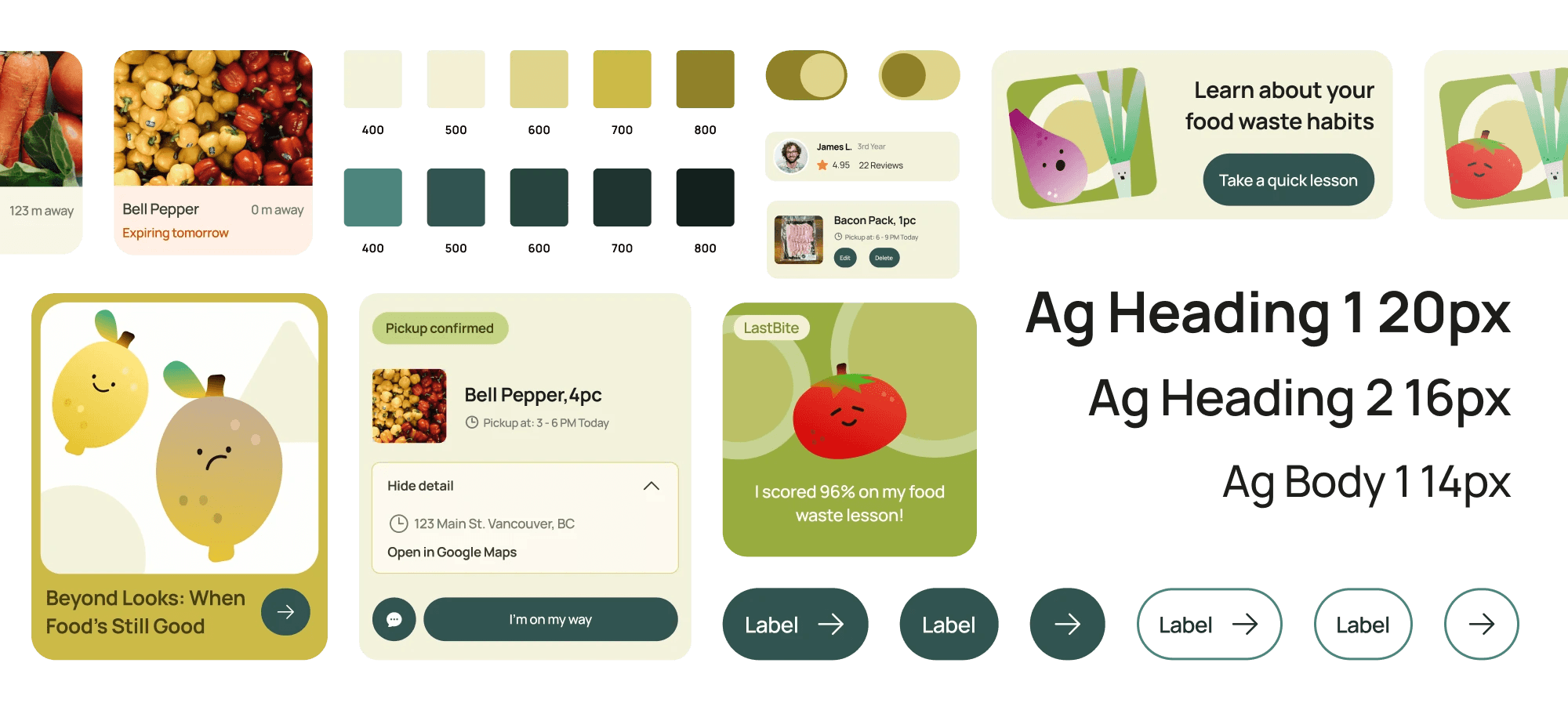
DESIGN SYSTEM & VISUAL IDENTITY
Built to support gamification and speed up iterations.
15 reusable components and a set of custom illustrations, built to handle the playful-functional balance the redesign required. The system made it possible to maintain visual consistency across 40+ screens without rebuilding from scratch between iterations.
WHAT COMES NEXT
What the prototype cannot answer yet.
Does the habit loop actually work?
he reward system and lesson cards are hypotheses. Only a real pilot, a few weeks with actual users, tracking whether they come back without being prompted, would answer that.
What was left out on purpose.
Food safety content, notification timing, and the logic behind hyper-local matching were all scoped out deliberately. Each one is its own design problem and the wrong thing to solve before the core loop is validated.
End
REFLECTION
The redesign taught me to question solutions.
Question the solution before refining it.
Coming back a year later meant asking whether we had defined the right problem at all. The shift from designing a handoff to designing a habit loop was only possible because I was willing to critique work I had already been graded on.
Retention is a design problem.
The question "will they come back?" is a design question. Building the reward loop, the lesson cards, and the persistent fridge were answers to a retention brief, even though the project never called it that. That framing is what I take forward.
Designed & Built • 2026