Applied Science Brand Hub
UBC Applied Science is one of Canada's largest faculties, home to unit communicators who rely on a central brand hub to stay consistent.
I redesigned the hub’s navigation to improve the discoverability of brand assets.
Team
2 UX Designers
Status
Shipped
Year
2025
Live Public Site
*Intranet portion requires CWL login
KEY IMPACT
30%
Fewer support requests to the Admins/Comms team
40%
Faster template find time in task-based interviews
25%
Fewer internal pages through consolidation
SOLUTION
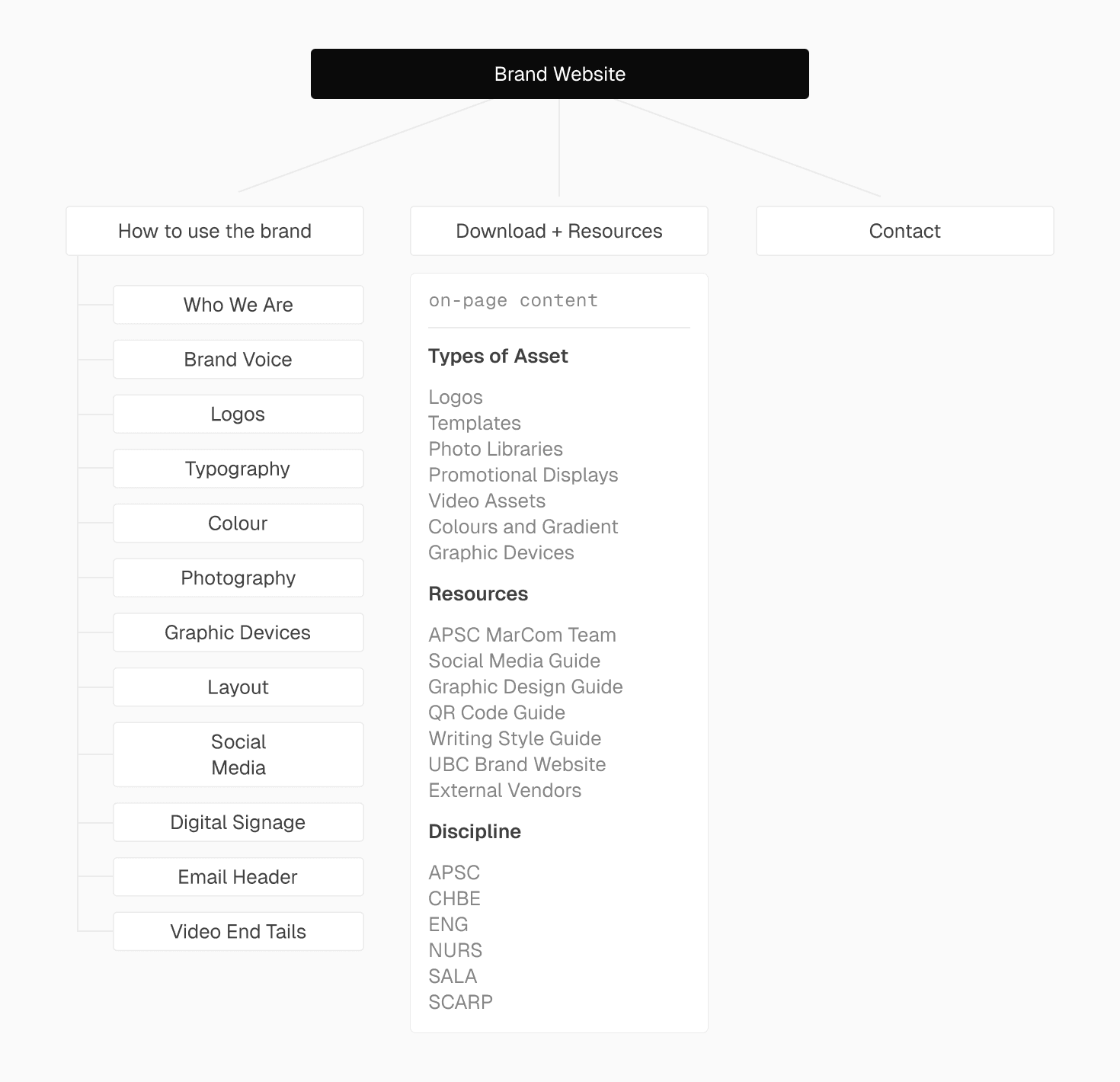
From endless information to clear choices.
The brand hub had two jobs that lived in two places. Guidelines on a public site. Templates and assets on the intranet. Communicators didn't think in terms of platforms. They just needed the right file, fast. I redesigned each system for how its users actually think.
Public Site
I structured content around common scanning patterns (F-pattern reading), so the most important context and actions show up early, with details available further down for deeper reading.
Communicators can read the guidelines and grab what they need in the same flow, without one getting in the way of the other. Fewer support requests, fewer brand violations.
View live at brand.apsc.ubc.ca

Intranet
Years of content accumulation had made the intranet impossible to navigate. But the another issue was identity. Communicators thought of themselves as SALA, CHBE, SCARP, which are sub-units, not APSC. I rebuilt the system around that.
The intranet is internal material, so screenshots are unavailable.


Part 1: Public Brand Site
PROBLEM
The brand site had everything. Except a clear path through it.
Three patterns showed up consistently in early feedback. Users didn't know where to start. Frequently used content was buried by scrolling, and guidelines kept getting skipped, communicators grabbed assets without reading the rules, letting brand inconsistency creep in quietly.
The Comms team (site owner) ended up answering the same questions on repeat.
One thing made this harder than a typical navigation problem. Guidelines lived on a public site while templates lived on the intranet. However, communicators' goal remains the same. They needed the right file fast without accidentally grabbing the wrong version. That meant designing two systems around one mental model, as one journey.

USERS & STAKEHOLDERS
Three groups. Three definitions of "organized."
Communicators
END USER
Find the right asset fast and trust it's current.
Comms Team
SITE OWNER
Fewer repetitive questions. A structure easy to maintain.
Digital Team
US
Something scalable that won't break as content accumulates.
A recurring tension: admins wanted to show everything. users wanted only what applied to them.
DISCOVERY
Users weren't ignoring the guidelines. They just couldn't find them fast enough
I audited what existed and where users got stuck.

I learned that the content was all there but the structure had grown without logic. Communicators couldn't find what they needed, and the Comms team kept answering the same questions.

STRATEGY + ITERATIONS
A findability problem first. Visual design second.
I started with four clear ideas before touching any layout.
Clarify what belongs at Level 1 vs Level 2, so the most-used content is one click away.
Regroup and relabel pages to match how communicators think, not how admins had organized things historically.
Add sub-landing pages per category so users choose a direction instead of scrolling through everything.
Make long pages scannable with quick links, consistent headings, and repeatable section patterns.
Then came the iterations.

8 iterations, each tested before moving forward. Most changes came down to structure and labels, and a tension that kept showing up: what made sense to the Comms team didn't always made sense to communicators. Finding the middle ground was most of the work.
VALIDATION
I stripped the UI out and tested the structure alone.
I ran tree tests with post-its and no interface, just labels and hierarchy. If communicators got lost during the test, the structure and user journey were the problem, not the interface.
Findings
4/4 tasks completed pretty smoothly, but all testers were admins who navigate the system daily.
For phase 1, that was enough: I needed to validate structure and label logic before anything went live. Testing with communicators came in phase 2, and told a completely different story.
Part 2: Intranet
PHASE 2 | INTRANET
Fixing the front door revealed the chaos in the back room.
Once the public site felt navigable, the intranet became the obvious bottleneck. Users arrived in deadline mode to grab one file and faced a document dump. Eleven top-level navigation items with no clear grouping logic, everything at the same hierarchy, documents accumulating over years with nobody owning the cleanup.
I pushed for user research before touching the structure. We ran task-based interviews across four units, CHBE, SALA, SCARP, and Dean's Office, and asked people to complete real tasks using actual templates. Heavy Ctrl+F use told us scanning wasn't working, and a pattern kept coming up between what admins wanted to show and what communicators actually needed to find. Then an insight from the testing changed the direction entirely.

KEY INSIGHT
APSC didn't mean what we thought it meant.
The term APSC (Applied Science) is technically correct but psychologically exclusionary. Several communicators didn't identify as "APSC." They identified as their unit: SALA (School Of Architecture And Landscape Architecture), CHBE (Chemical and Biological Engineering), SCARP (School of Community and Regional Planning), etc. They don’t always feel closely connected to the broader APSC brand day-to-day.
Anything labeled "APSC" felt like it might not be for the end users.
This reframed the entire intranet structure. Away from a faculty-wide library, toward unit-first navigation.

DESIGN DIRECTION
Stop organizing around the faculty. Start organizing around the unit.
The public site fix was structural. The intranet needed that too, but with an added layer. I restructured content around two real journeys: communicators arriving in deadline mode to grab the right file fast, and admins needing a system that's easy to maintain and expand.
That drove two decisions: simplify the top-level nav, and make it possible to self-select into your unit without wading through everything.
Key Actions
Reduced navigation items.
Browse by unit entry point added.
Most-used files surfaced without browsing.
Content blueprint shipped so new pages have a home before they're created.
KEY CHANGES
Here's what shipped.
Change 1
Change 2
Change 3
Change 4
End
REFLECTION
The takeaway I'm bringing forward.
Metrics make decisions defensible.
Tying every navigation decision to a measurable outcome (support volume, find time, duplicate pages) kept iterations focused and made rationale clearer to stakeholders.
Early feedback skews toward whoever is closest to the system.
Admins gave fast, useful feedback, but their mental model wasn't the end user's. Tree testing without UI helped me hear from the structure itself. Expanding to end users during the intranet phase surfaced problems I wouldn't have caught otherwise.
Ship something that scales, not a one-time fix.
The content blueprint means future pages have a home before they're created. That's the difference between a redesign and a system.