Grapevine
A short blurb to describe what to do
Overview
For this design sprint, we were tasked to help newcomers start their professional career journey in Canada. We conducted research, collaborated and packaged our ideas into a networking app that aims to help newcomers in Canada start their professional career in this new country.
My Role
UX & UI — Interaction Design, Visual Design, User Flows, Rapid Prototyping, Presentation
Team
3 UX Designers, 1 Content Strategist
Timeline & Type
48 Hours, Design Sprint
🇨🇦 New immigrants in Canada found it hard to find suitable jobs.
Moving to another country is not only difficult but also scary. For this design sprint, we were tasked to help newcomers start their professional career journey in Canada.
Solution Overview
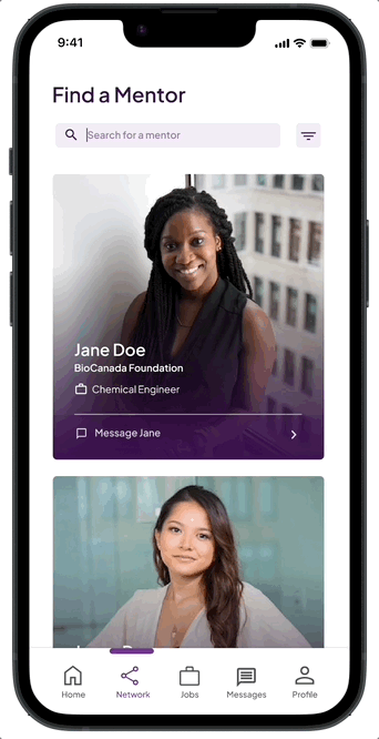
Mentorship & Networking
• Creates meaningful network and connections
• Becoming familiar with occupational language
• Finding jobs through networking
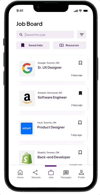
Immigrant-friendly job postings
• Finds Jobs that match their skills
• Eligible job postings that help offer "Canadian Experience" asked by employers
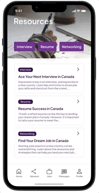
Resources
• Help all newcomers adjust to new professional culture in Canada by giving interview tips, resume tips, and more!
• Resources tailored specifically for job-hunting in Canada.
Lack of connection is making the job search more difficult.
Moving to another country is not only difficult but also scary. For this design sprint, we were tasked to help newcomers start their professional career journey in Canada.
Lack of connections
Difficulty finding job postings
Employers neglecting foreign education
Language and cultural adjustments
🔍 The deeper roots: Women and gender minority face more difficulty in job search.
To explore more about the underlying problems, we looked into different articles, stats and personal stories both online and though primary users interview. Here are out key insights:
Then there is the gender factor. An interviewee explained that immigrant women with children are assumed to prioritize family over career, but the same is not expected of immigrant men.
There’s an unemployment gap between Canadian Born Women and Recent Immigrants Women in Canada.
I have 3 years of engineering experience and graduated top of the class BSc. I've sent about probably more than 100 job applications online and yet no interviews. Some say it's all about connections but being a new immigrant, I don't have much. I'm fairly social, not at all shy. Am I doing something wrong?
⚡️This can’t just be another LinkedIn.
Competitive Analysis
I started by checking out what’s already out there—exploring similar products to see what they’re doing well and where they’re falling short. This gave me a good sense of what works and what doesn’t, plus some ideas for how we can stand out and bring something new to the table.

Design Opportunities
From there, I dug into where we could make a real difference. I looked at what the user insights and the analysis we did, seeing if there is any gaps and we could fill in. This phase was all about spotting opportunities to make our design smoother, smarter, and more user-friendly.

Feature Ideation
Once we had a solid understanding, we started brainstorming different features we could include. I thought through what would make the biggest impact and refined it all into a set of features that align with our goals and user needs—keeping it practical, but also ambitious enough to set us apart.

👩 Mentor? Who would want to be a job search coach?
We were initially skeptical about mentor sign-up incentives, but the success of ADPList demonstrated a strong willingness among people to help others, especially if they had been in similar situations.
Having faced the challenges of immigrating and job hunting, I want to help others who are going through the same difficulties.
I can recall one heart-to-heart talk with a woman who didn’t feel ready to go through a job interview. I've been on that end and I want to give back to the woman I was 12 years ago.
(Article posting)
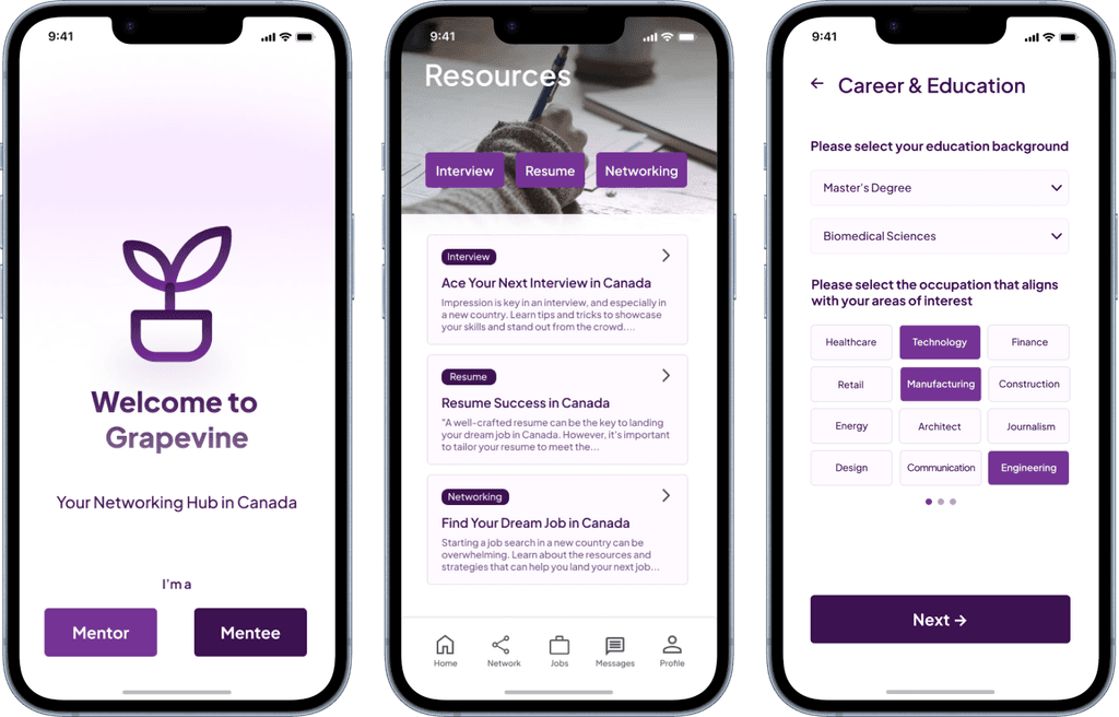
🧩 Sitemap & Flow
After narrowing down our scope, we decided to go with on solution we came up with a networking hub for women and gender-minority.
🎨 Lofi Screens
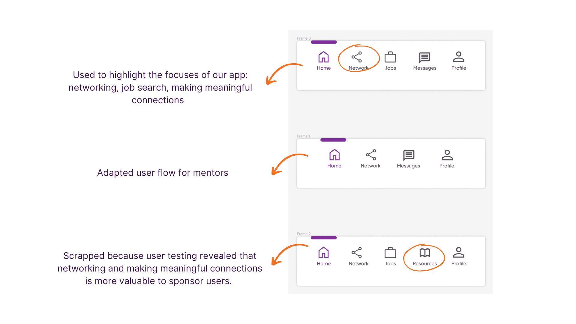
We created low fidelity screens to better vision how each screen would look like. We also conduct a user-testing and made change to our initial navigation bar to better adapt to users’ needs.
We made a few key updates after reviewing our initial wireframes:
Added a "Networking" tab to the main menu to highlight the app’s main focus and ensure it’s easy to find.
Removed the "Jobs" menu for the mentor flow, since mentors don’t need it. This helps keep their interface clean and relevant.
Consolidated "Resources" under the homepage instead of a separate menu item. Our research showed that users found it more valuable and convenient when accessed directly from the home page.
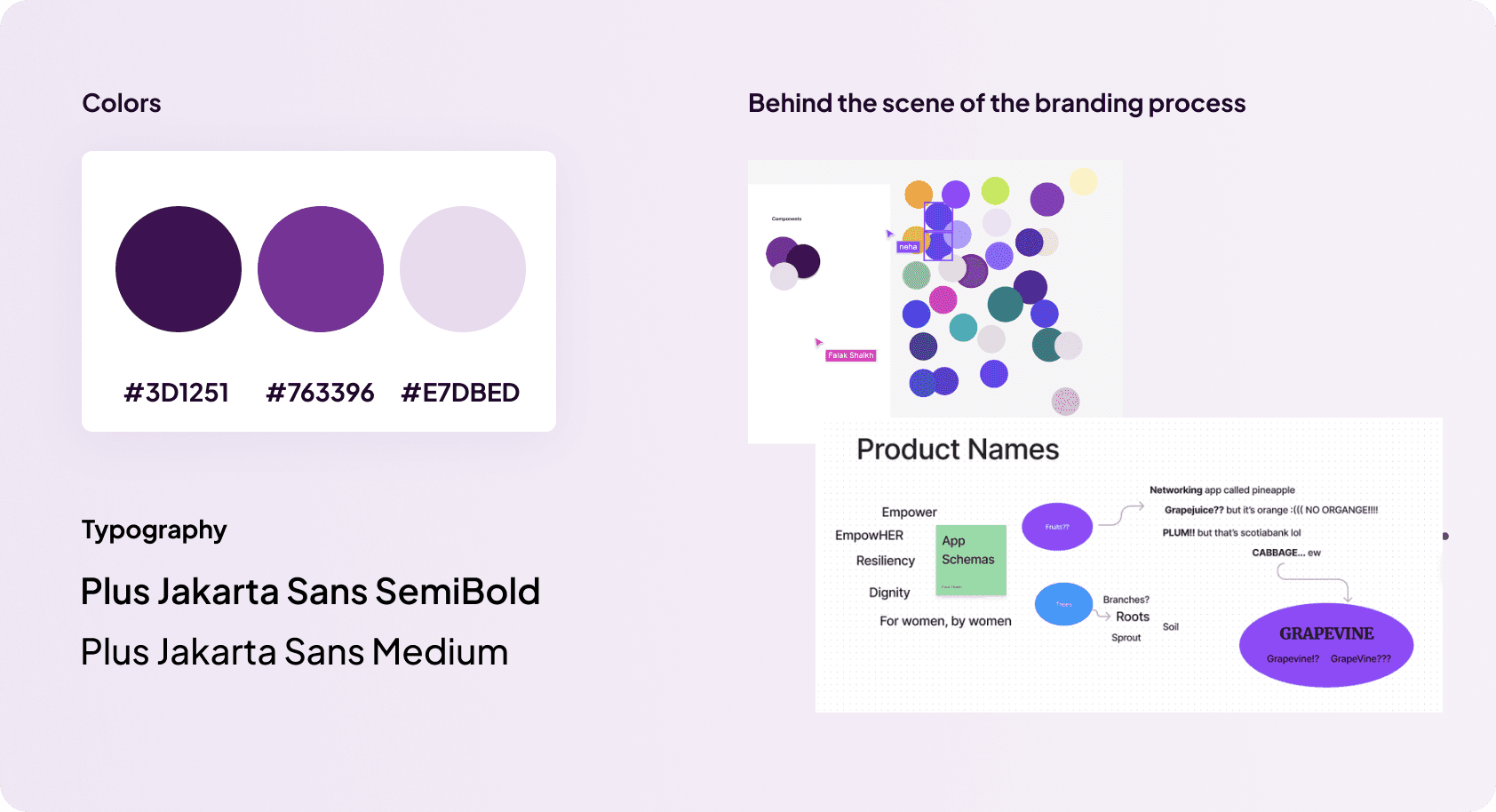
🎨 Style Guide
We came up with a style guide to maintain brand consistency across all our screens as we are working together remotely from different timezones. During the branding barnstorming process, we also try to come up with the name and color that aligns with our app’s value in uplifting women.
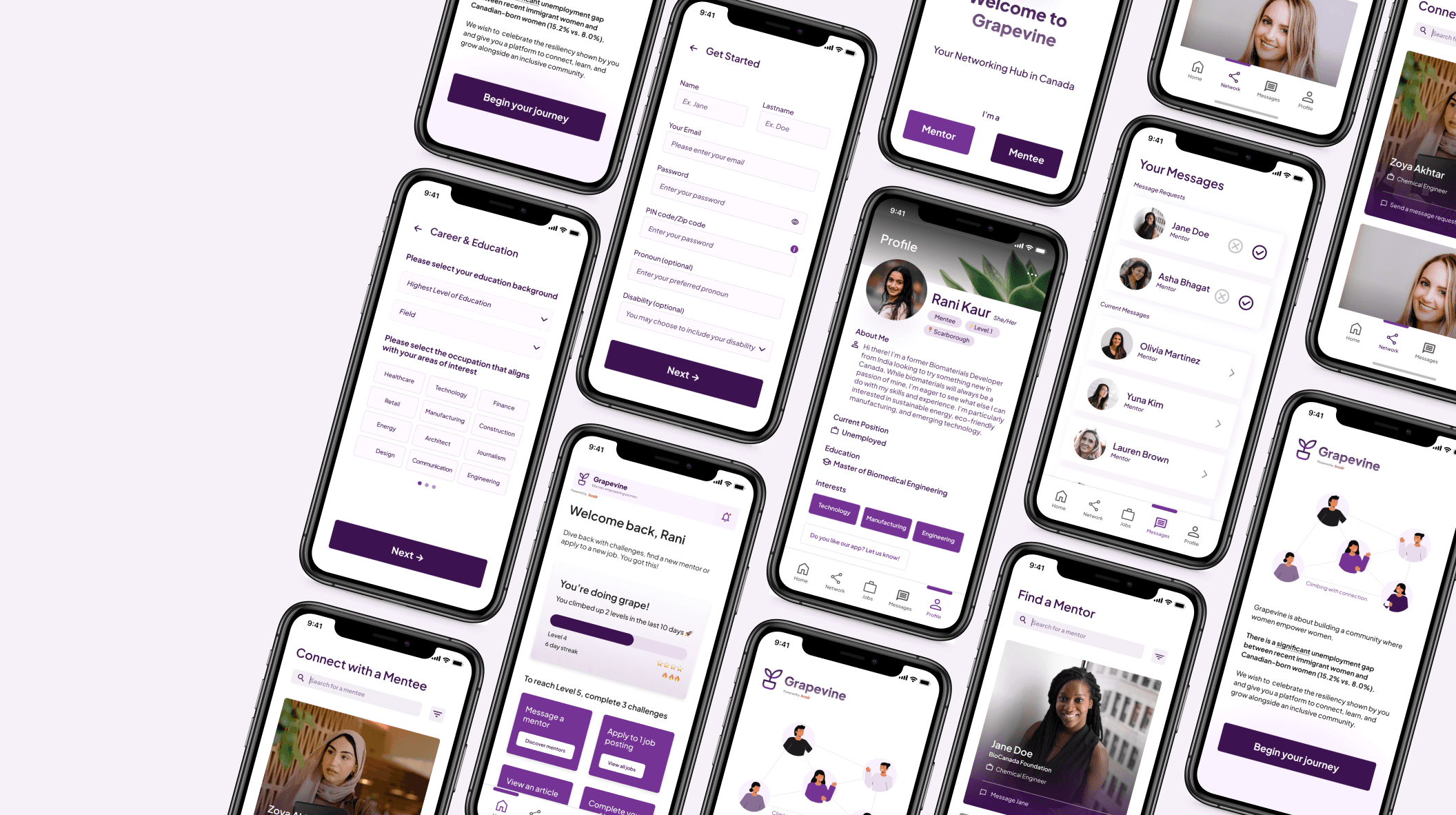
🎨 Hi-fi Designs
After the initial changes were implemented, we created all our high-fidelity screens before making them into a working prototype!
🔁 Iterations
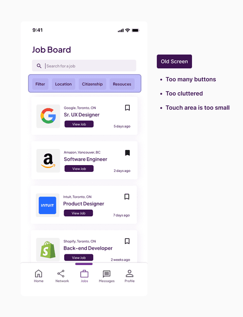
We conducted a usability test with 5 users to evaluate our initial wireframes and identify areas for improvement. Based on the feedback, we made several key iterations to enhance the overall experience.
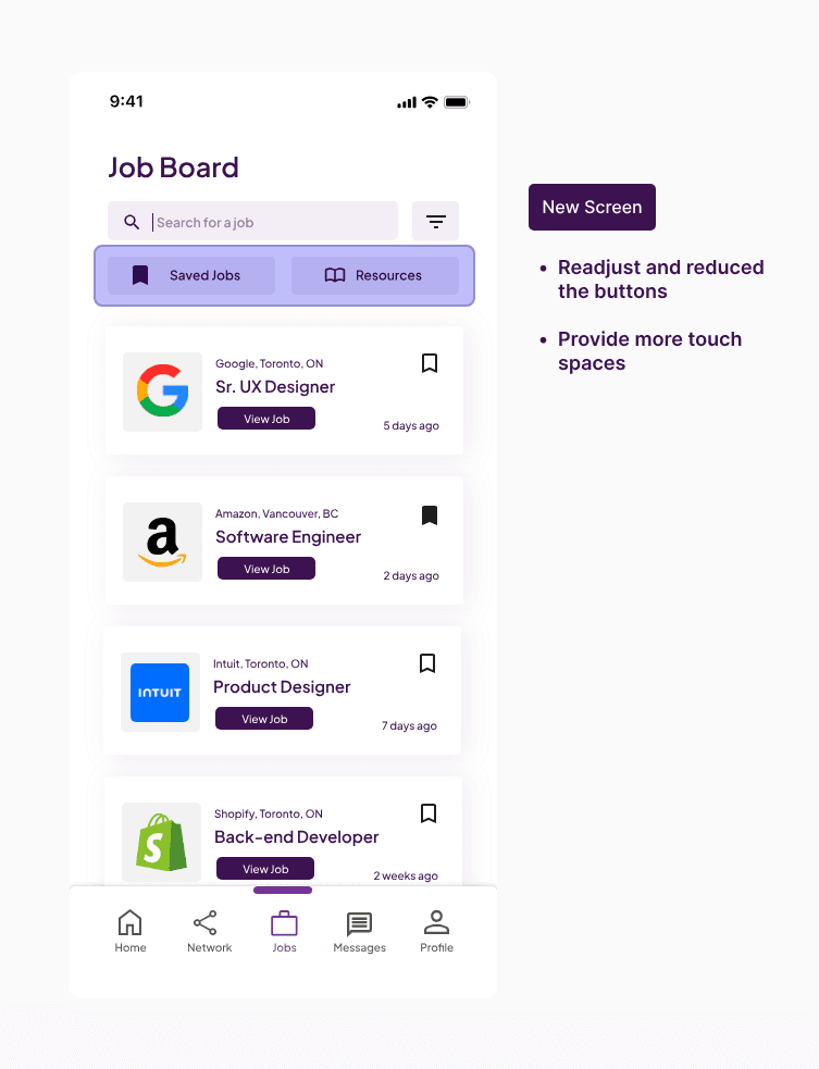
Readjust the number of buttons
The old menu tab had too many buttons with small touch areas, making it feel cluttered and hard to navigate. In the updated version, we reduced the number of buttons and increased the touch space, resulting in a cleaner design that’s easier to use and less overwhelming for users.
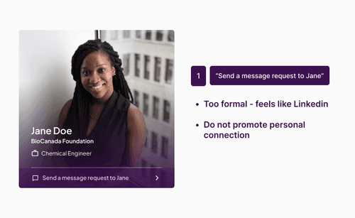
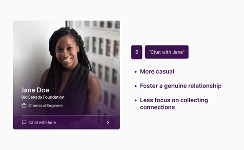
Improved UX copy
The original text felt too formal—similar to LinkedIn—and didn’t promote genuine connection. To create a more welcoming experience, we changed the wording from “Send a message request to Jane” to a friendlier “Chat with Jane,” making interactions feel more approachable and human.
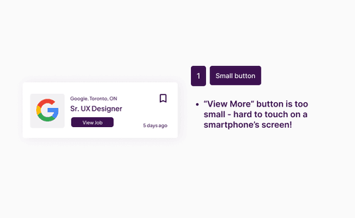
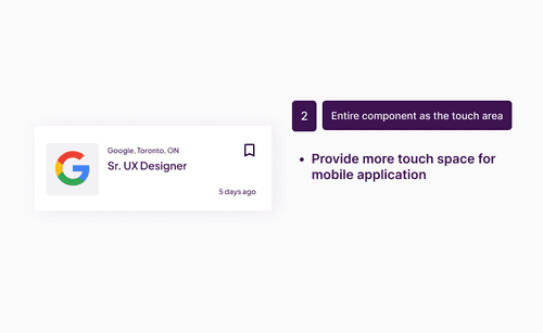
Adjusted the card touch space
The initial “View More” button was too small, with poor touch size, making it difficult for users to tap comfortably. We enlarged the button and increased its spacing, improving accessibility and making it easier to interact with.
🎨 Our considerations - Accessibility & Privacy
We conducted a usability test with 5 users to evaluate our initial wireframes and identify areas for improvement. Based on the feedback, we made several key iterations to enhance the overall experience.
Contrast & Touch area
We ensure that the contrast is as inclusive as possible, as well as making sure the touch area is at least 44px for mobile apps.
Safe & Secure
We ensure that users know why we are collecting certain information, such as zip code.
Reflection - The magic of collaboration ✨
Working in teams with 4 other designers who are in different timezones was a challenge. However, it was fun and very fulfilling.
Future improvements, I would consider coming up with a more detailed style guide early on (grids, alignments, text sizes and color) as well as any component (nav bar, gradient type, etc.) in order to save time refining our final product to look more consistent.